HF propagation dashboard
OnlineBuilt and running now, free for anyone to use.
It started as a small experiment and has turned into something I use most days: a web dashboard that tries to answer one practical question, which bands are actually open from my station right now.
It lives at hfprop.g4eid-km8h.net. Set your locator and it tailors everything to your station. What follows is the plain-language tour. There is a fuller User Guide and a How it works page on the dashboard itself if you want the controls in detail or the full physics and maths.
Why I built it
Propagation forecasts are useful, but they answer a slightly different question to the one I actually have at the radio. A forecast tells me what should be possible. What I want to know is what is working right now, from my station, on the antennas I have got.
The first version of this was firmly UK-centric. The maths assumed a station in these islands, and a lot of the logic was wired to that assumption. That was fine as an experiment, but it put a ceiling on what the tool could become. I also wanted to be honest about something that had drifted in that first version: prediction and observation had started to blend together into a single number, and a single number hides exactly the disagreements that are most interesting. When the model says a band should be dead and the band is plainly alive, that gap is the story, not noise to be averaged away.
So the rebuild had two firm rules from day one. It should work for any location in the world, driven by your locator rather than a hard-coded position. And the forecast and the measurement should always be shown as two separate numbers, never merged.
What it does
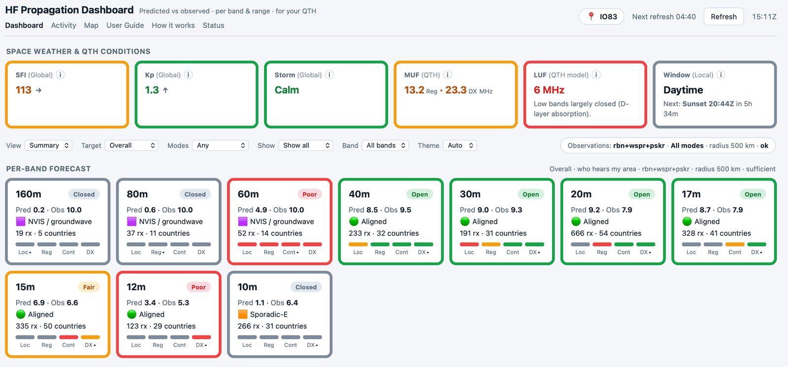
At its heart the dashboard shows, for each HF band, two scores side by side:
- Predicted: what the physics says the band should be doing, given the current ionosphere and solar conditions.
- Observed: what stations on the air are actually proving, right now, near your location.
Both sit on a simple 0 to 10 scale, and both are broken down by distance: Local, Regional, Continental and DX. A band can be wide open for short hops and shut for DX, and the dashboard shows that rather than collapsing it into one verdict.
Around the band table sits a row of condition tiles for the bigger picture: the Solar Flux Index, the planetary Kp, the geomagnetic storm state, the Maximum and Lowest Usable Frequencies calculated for your location, and a day or night window with the next sunrise or sunset. There are a few different views, including a compact matrix, and a mode filter so you can look at the world through CW, digital or phone.
How the prediction works
The predicted score is deliberately physics-led. There are no hidden per-band fudge factors tuned to make the output look plausible. Every term means something you could check by hand.
For each band and range the score is the product of four factors, each between 0 and 1:
- A MUF factor: is the band below the Maximum Usable Frequency for the path? This is the dominant term for the high bands.
- A LUF factor: is the band above the absorption floor? This is what closes the low bands in daylight, when D-layer absorption is high.
- A Kp factor: a penalty when the geomagnetic field is disturbed.
- A time-of-day factor: high bands favour daylight, low bands favour darkness.
Because the factors multiply rather than add, any single show-stopper closes the band correctly. A band above the MUF, a band below the LUF, or a severe storm will each pull the score toward zero on its own, which is exactly how the real ionosphere behaves. The MUF and LUF themselves come from real-time ionosonde measurements where available, falling back to a solar-driven estimate when they are not.
How the observation works
The observed side asks a concrete question: in the last hour, who actually heard a station in my area, and how far away were they?
To build that picture the dashboard takes every spot whose transmitter sits within a radius of your location, and bins each one by the great-circle distance to the receiver that heard it. If there is not enough evidence close in, it widens the radius in steps until it has enough to be meaningful, and it tells you which radius it used.
Crucially, it does not just count spots. Counting raw spots would mostly measure how many receivers happen to surround you, not how good the band is. Instead it works out a reach fraction: of the receivers actually listening in each distance ring, how many heard your area. That keeps a busy band in a crowded part of the world honestly comparable to a quieter one elsewhere. The spots come from the Reverse Beacon Network, WSPR.live and PSK Reporter, streamed continuously into a local store with a rolling time window.
Putting the two together
Rather than blend the two scores, a small confidence indicator compares them and tells you how much to trust the comparison:
- Aligned: the forecast and the observations agree. The model is doing its job.
- Better than forecast: reality is beating the model, the band is doing better than the physics predicted.
- Conflict: the observations fall well short of the forecast, with enough evidence to trust. The physics is being optimistic.
- Unconfirmed: too few receivers heard your area to corroborate anything, so lean on the forecast. Thin evidence can never raise a false alarm.
That last state matters. From the open ocean or a quiet corner of the world there may be nothing to observe, and in that case the dashboard says so plainly rather than inventing a number. The disagreements are the useful part. When observation beats the forecast, something is open that the model did not expect. When it falls short, conditions are worse than advertised. Either way, it is the gap that tells me where to point the antenna.
Honesty about the limits
This is a tool I find useful, not an official forecasting service, and there are real limits worth stating:
- The spotting networks are CW, digital and beacon robots. There is no direct SSB evidence, so the phone view currently infers from the modes it can see. Doing that properly is on the list.
- The PSK Reporter feed is a one percent sample, so very sparse regions are under-represented.
- Remote and mid-ocean paths often cannot be observed at all, which is exactly why the dashboard is honest about saying Unconfirmed.
- Predicted is a model. It captures the dominant physics but not every mechanism, and that is precisely why the observed side sits next to it.
A note on how it was built
As with everything here, I should be open about how this was made. The idea, the design direction and the amateur-radio knowledge are mine, but the code itself, the engine, the collectors and the site, was written with heavy use of AI assistance. That is part of the experiment for me: seeing how far a single operator can take an idea like this with these tools. I find that nearly as interesting as the propagation itself.
With thanks
None of this would exist without the data that others generously make available, and all rights in that data stay with the people and organisations who produce it. The space weather comes from the NOAA Space Weather Prediction Center, and the solar numbers from Paul Herrman, N0NBH, through HamQSL. The real-time ionosonde data comes from KC2G (Andrew Rodland), aggregating worldwide Digisonde data from GIRO and the Lowell GIRO Data Center under a non-commercial licence. The observed half is built on the Reverse Beacon Network, WSPR.live and the WSPRnet community, and PSK Reporter, with human-posted spots arriving through the DX cluster network. To every operator who runs a skimmer, a beacon or a reporting receiver: thank you. Your stations are the observed half of this site.
It is still very much a work in progress, and feedback is genuinely welcome: what you find useful, what is unclear, and whether it matches what you are hearing on the bands.